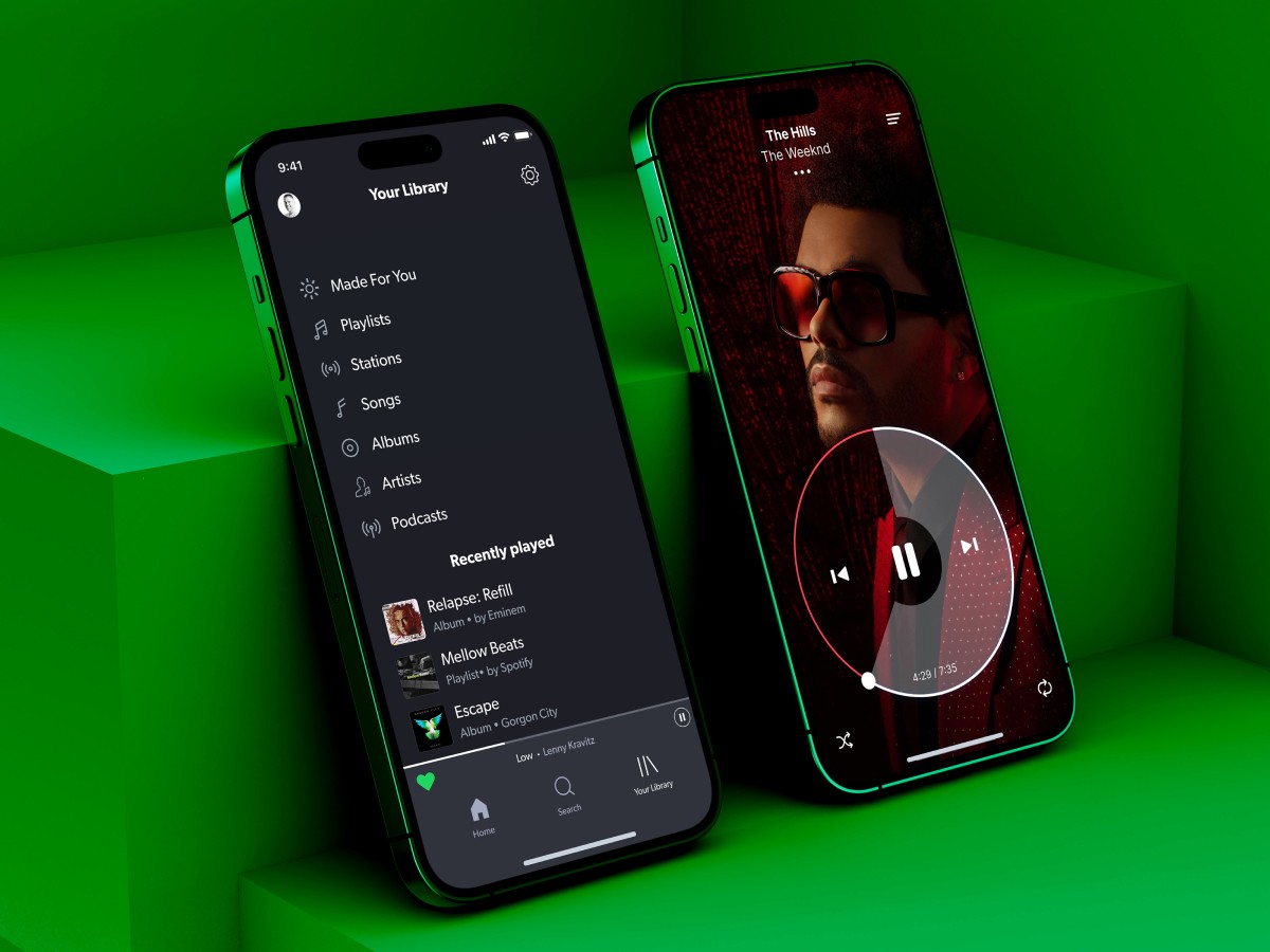
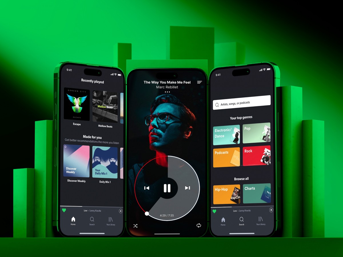
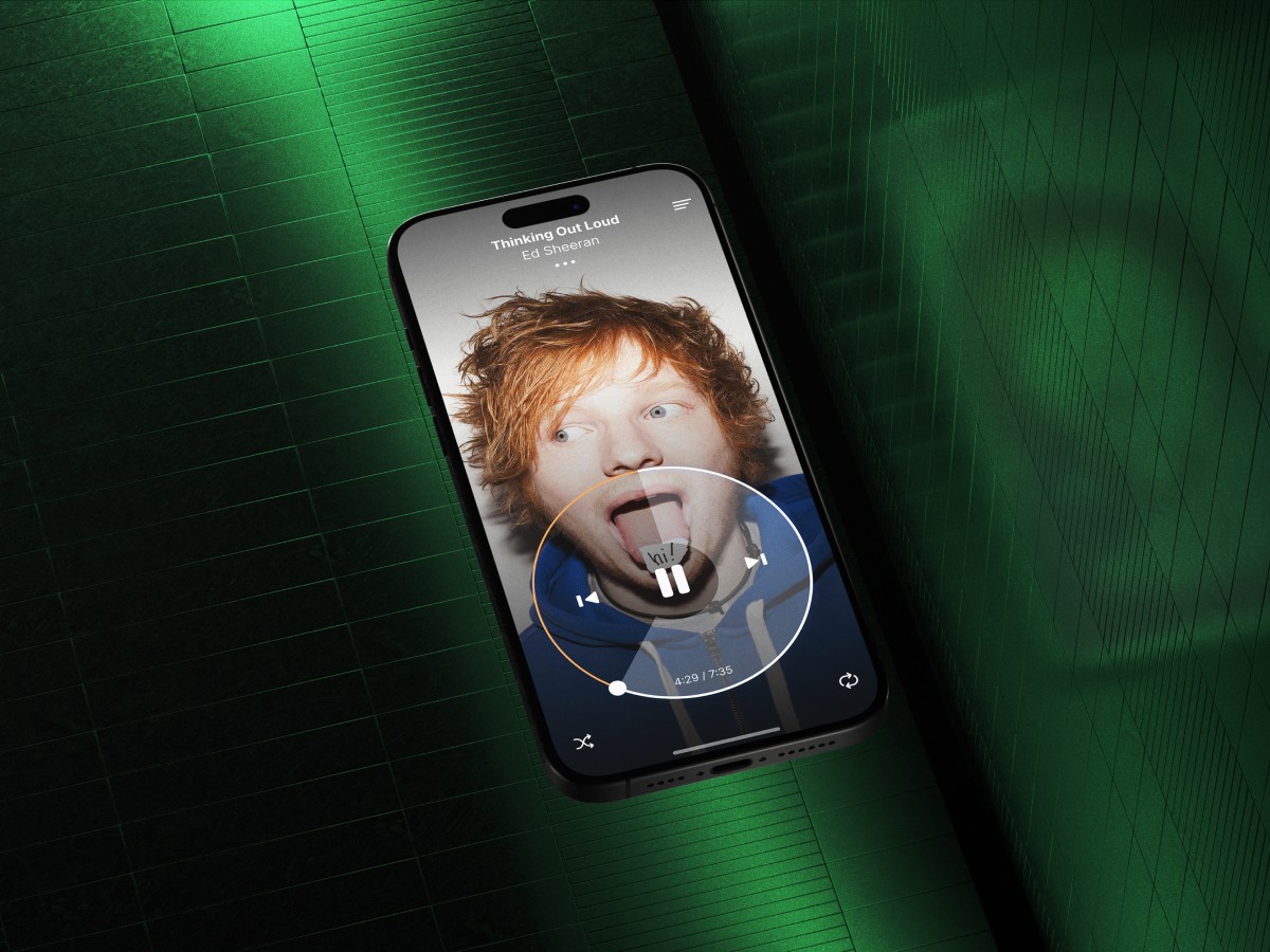
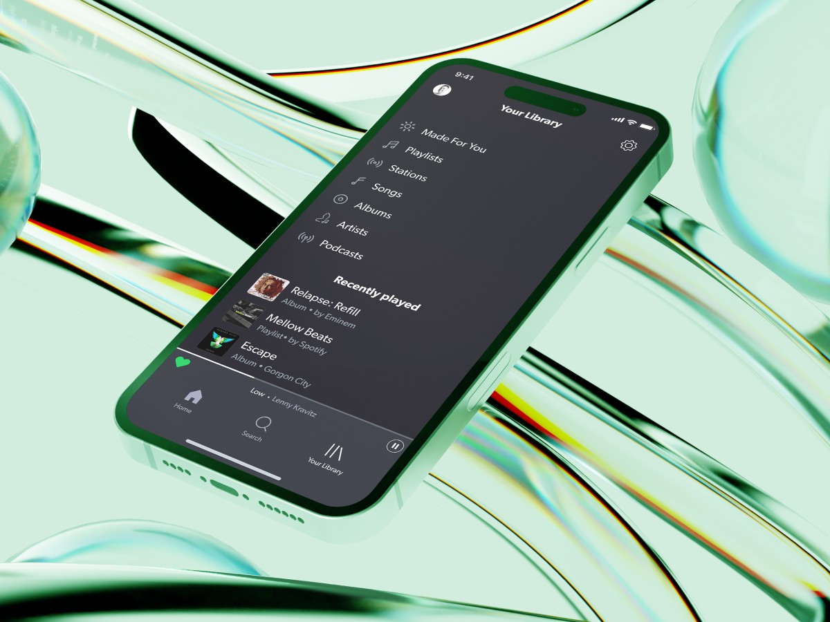
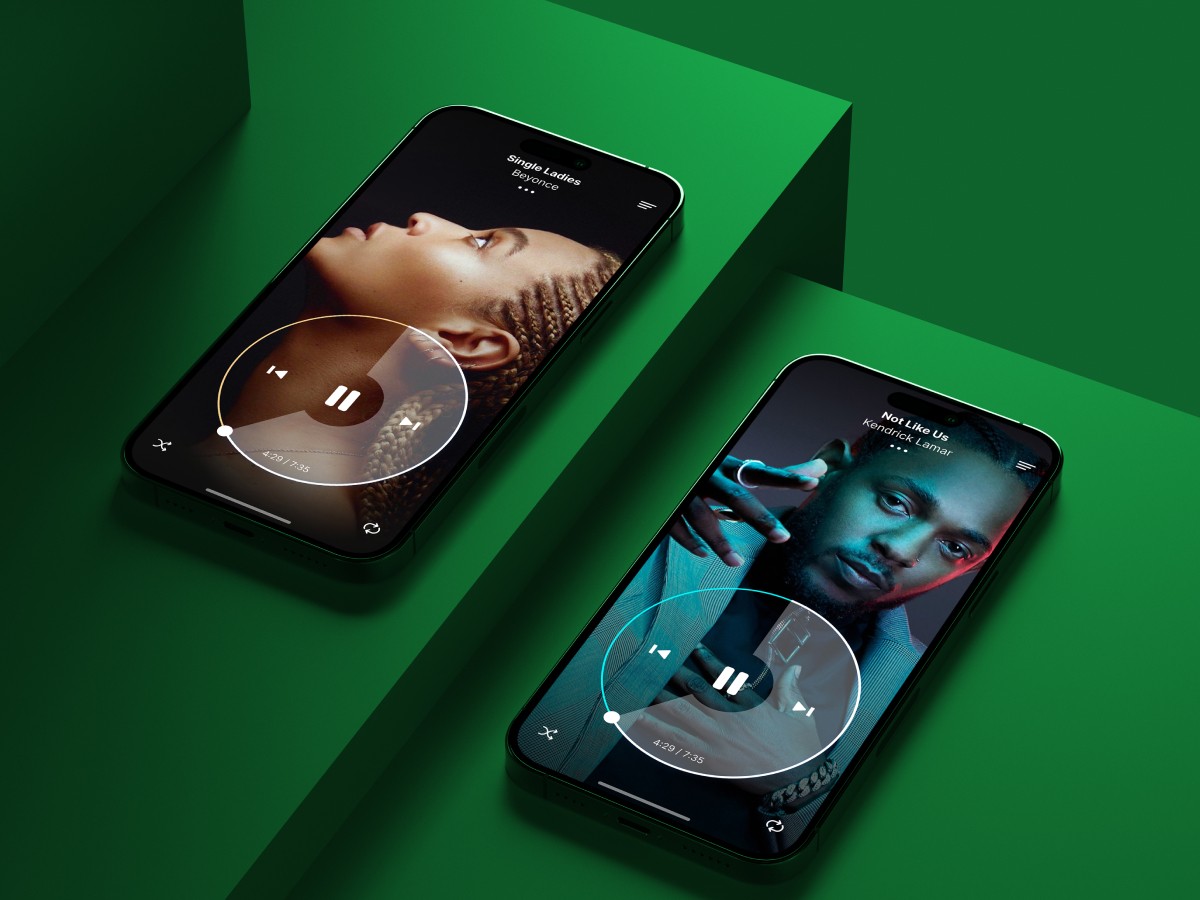
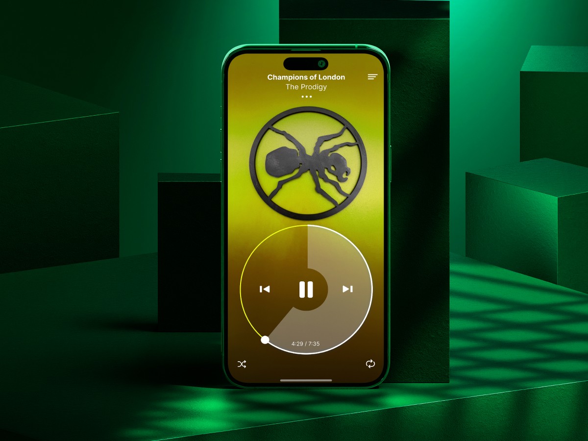
iOS mobile app redesign concept with circular player controls instead of traditional linear timeline.
GOAL:
UX Design, UI Design, Concept Design
RESULTS:
↑ +76.5% Positive User Retention
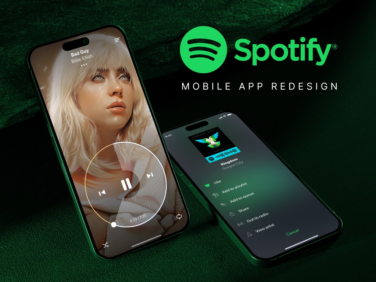
A designer friend at Spotify approached me with an exciting challenge: to help redesign the player in their iOS mobile app. They wanted to explore new variations of the player controls and track timeline, specifically testing out a circular timeline instead of the traditional linear one. It was an opportunity to push boundaries and create a more engaging user experience.
The primary challenge was reimagining how users interact with the timeline. Linear timelines are the industry standard, so introducing a circular design came with potential usability risks. We needed to ensure users could adapt easily while maintaining the same level of control and clarity. On top of that, technical limitations like creating responsive touch gestures and maximizing screen space for a small mobile interface posed additional hurdles.
We designed the circular timeline with both ergonomics and engagement in mind. Circular controls fit more naturally with thumb movements on mobile devices, providing a smoother experience for one-handed use. The minimalistic design maintained clear playback controls, and subtle visual and haptic feedback enhanced interaction. This playful and dynamic design invited users to explore track navigation more intuitively, making it both functional and aesthetically appealing.
Focus groups reacted positively, highlighting how the circular timeline felt more natural and engaging. Users appreciated the innovation and found the design intuitive, offering a unique spin on track navigation that set Spotify’s player apart from other music apps. The experiment proved successful, showing that rethinking traditional elements could lead to a better, more user-friendly experience.
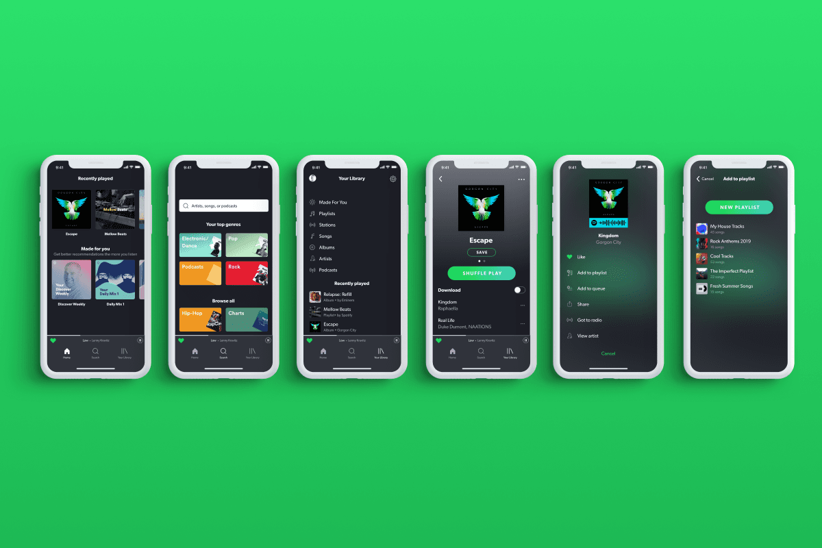
Here's just a few of the designs we delivered. This remained only a concept and never made it to the real product, however we are very proud of it. Take a look for yourself.
